

An exercise in reshaping a complex existing application

The application, project, and results
This writing assistant application provides services to writers of any discipline to create researched, annotated, style-guided papers for academic coursework or creating blogs, creative writing, and professional written assets. It is a legacy product that brought together many different functions from different applications. The continuing design challenge has been to unify the visual design and focus on features most useful to its audience.
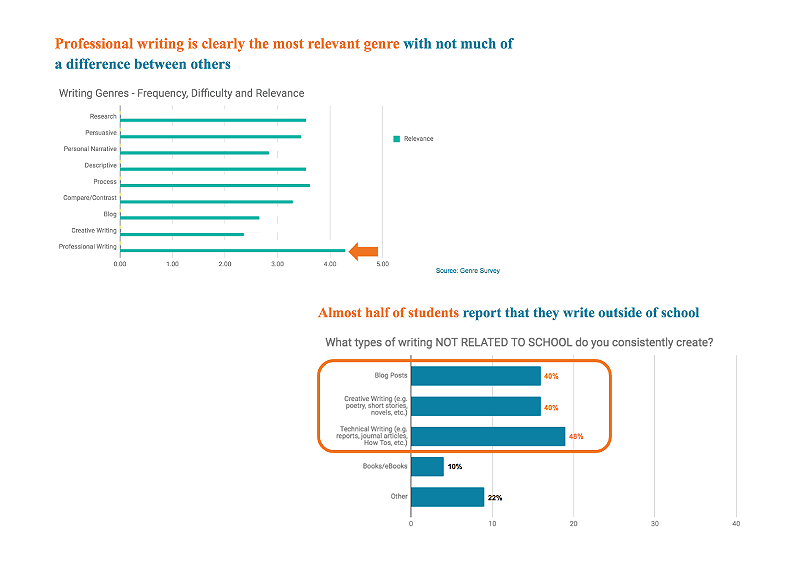
Understanding Writer’s changing users was an important part of its development. Research and Learning Design found that professional (non-academic) writing was the largest growing writing genre, and that almost half of all students questioned were involved in writing outside of their usual academic assignments.

One of the existing functions is a Writing Review tool. The original design went through many iterations over the years. Competitors were entering this same product space at a rapid pace and providing increasingly compelling alternatives. One of Writer’s goals, based on testing, was to provide as much contextual information as possible about why spelling, grammar and usage issues were being flagged in the review tool. This was one iteration of the design, but it proved to be too detailed to be useful to the writer as feedback.

Another of the app’s functions is a note clipper: a tool that saves written notes or URLs as note cards. These cards can then be organized into an outline for a written paper. The design was in dire need of redesign and reskinning.
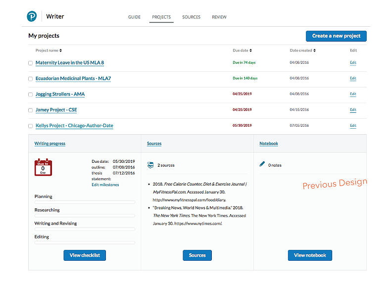
The product also includes a dashboard. The original design included a pop-out view of individual project statuses. This also proved inadequate for providing enough information at the right time for writers to know where they were in the middle of their project.

Many of the redesigned features utilized important data from our Accessibility team. The Writing Review feature removed the multicolor coding, simplified the delivery of contextual usage data, and employed a tabbed structure in the left sliding panel to access the different writing analysis tools.

The redesigned Note Clipper first began by an analysis of how we were treating the overall design of tiles (or cards). We first did a lengthy assessment of how they were being used across products in our group, addressed the different use cases, and then designed a component tile. Once that was complete, creating a new and refurbished Note Clipper was far easier.

The Project Summary area was also simplified and improved upon. First, new visual styles (as part of a company-wide design effort) were introduced. Then the decision was made to allow writers to create their own organizational structure for their summary. This is a view of the initial screen…

…and this view shows the completed Project Details screen, as customized by the writer.
This video shows the creation of the Outline tool within Writer. It exemplifies many of the complex UX designs that needed to be addressed for a product that has so many different features, particularly in light of Accessibility needs.